Friday, October 9, 2020

Scale and Gerrymandering

 This week, we reviewed how scale affects our analysis and understanding of vector data and the basic resolution of raster data. With regards to vector data, as map scale moves from large scale to small scale, it has the effect of reducing our ability to be accurate and precise in measuring landscape features. The number of specific polygons, total length, and the area is reduced because it is much harder to accurately depict what is and is not a specific feature. You have to be much more general in your analysis and descriptions. It is also much easier to miss features altogether when viewing on a relatively small scale.

The images below help depict the effect of scale on vector data:


When it comes to raster data, our resolution is much worse at small scales and it forces you to be very general in your analysis for whatever purpose that may be.  If we generate a raster at a large scale, our precision and accuracy can be much greater.

The table below illustrates how resolution affects our interpretation of slope.  In general, the better the resolution, the better our ability to identify steep slopes and dynamic landscapes.

DEM Resolution

Average Slope (degrees)

1m

39.25

2m

38.98

5m

38.39

10m

37.47

30m

34.81

90m

30.31


The second part of our lab dealt with gerrymandering.  Gerrymandering is the redrawing of congressional districts in order to favor one party over another.  Gerrymandering generally increases divisions based on wealth and race.  The effects of gerrymandering can be measured mathematically using the Polsby-Popper score where a score closer to one indicates a more compact district shape.  Districts with a very low Polsby-Popper score indicate that it is drawn with purposes that are not impartial.  Below is an image of the district in the contiguous 48 states with the lowest Polsby-Popper score:
As you can see from the image, this district (congressional district 12) makes absolutely no sense in terms of how you might imagine a district if it were drawn to include an impartial representation.  There is clearly a motive behind drawing north Charlotte, and the interstate to Greensboro and Winstom-Salem.  One must question the motives behind any political actors who draw such a district.


Thursday, October 1, 2020

Interpolation

 This week, we evaluated several methods of interpolation for efficacy in two different example scenarios: elevation and water quality. I will first describe briefly how these interpolation methods work.

According to Esri's help documentation, IDW (Inverse Distances Weighted) operates under the assumption that objects or things close together are more similar than things farther apart.  If we are interpolating what might be expected in a void, this method will assume the known data points closest to that void will be more similar that data points farther away. Each known data point has an influence that diminishes with distance.

According to Esri's help documentation on Spline interpretation, this method uses a mathematical function that attempts to create a smooth surface by minimizing overall curvature and passing through all known data points.  

For elevation, we evaluated the use of Spline and IDW from known elevation data points.  In this instance, Spline outperformed IDW in creating a more realistic display of the terrain.  The IDW method created many potholes and areas that did not seem to fit with what a natural landscape might be like.

For water quality analysis, we evaluated the use of non-spatial analysis, Thiessen interpolation, IDW and Spline (regularized and tension).  In this analysis, IDW was the most effective in presenting the data accurately and in a spatial distribution that reflects an intuitive sense of reality. This is represented in the table below:

Technique

Minimum

Maximum

Average

Standard Deviation

Non-Spatial


0.8

3.5

1.81

0.57

Thiessen


0.8

3.5

1.79

0.56

IDW


0.81

3.5

1.78

0.29

Spline


Regularized

-1.7

3.64

1.67

0.65


Tension

-9.79

9.64

1.81

0.76


Below is a representation of the most accurate method used in water quality analysis, the IDW interpolation:


And the same data represented by the regularized Spline method:

As you can see, there are some areas of contamination that are not really represented with the Spline method.  Because it wants to create a smooth surface, it overpowers the more anomalous known measurements in a way that ultimately creates an inaccurate representation.  It also assumes influence in perpetuity and is only cut off by the mask that we input manually.


Tuesday, September 22, 2020

TINs and DEMs

 This week, we explored Triangulated Irregular Networks (TINs) and Digital Elevation Models (DEMs).  The TIN is unique in that it allows you to evaluate slope, aspect and elevation in a way that is useful for certain types of landscape analysis and quick retrieval of information regarding these types of information.  An example of this is shown in the image below:

A quick click on any triangle and you can get the slope, aspect, and elevation of that area.  So they can act as a good quick reference for a landscape.  They can also give you a new perspective on landscape and allow you to think about your elevation analysis as it would apply to a DEM as well.


Below, I used a DEM and weighted overlay to give a visual analysis of ski slope suitability.  The DEM makes the appearance of elevation data appear more smooth and it better for general map making as it is pleasing on the eye.


Both elevation models are useful and have their place in the toolbox.  This week was a good exercise in understanding the tools and methods used in both applications.


Tuesday, September 15, 2020

Road Completeness

 This week, I completed an accuracy assessment of two road networks based on their relative completeness using 1km x1km grid for comparison.  The goal of this assessment was to determine which road network is more complete.  TIGER Roads or Street Centerlines, and to determine which locations are similarly accurate and which locations are more accurate with either of the two networks.  The method ology I used to achieve this is outlined below.

I first used the “Clip” tool to remove portions of each road network that were outside of the supplied grid network.  Once the roads outside of the grid area were clipped, I used the “Summarize Within” tool to calculate the lengths of the road system inside each grid polygon.  I specified the output in kilometers so as to eliminate the need to do a separate calculation to convert the results from feet.

Once I had the total feet for each grid and road dataset, I used the “Table to Excel” tool to export this information to Microsoft Excel and calculate the necessary statistics in order to produce the table and maps below.  Once the statistics were calculated, I used the “Excel to Table” tool to import the final Excel table back into ArcGIS.  Once in ArcGIS, I used the “Join Field” tool join the Percent Difference field I created in Excel to the Grid layer.  I then used this field and the Grid layer to generate the map.


As evidenced by the map, the completeness of the road network is within +/- 5%, but there are areas that diverge a lot based on the accuracy of each network as it relates to specific grids.  

TIGER_Roads total length in kilometers: 11,382.7

Street Centerlines total length in kilometers: 10,873.3

The TIGER Roads network is more complete based on this analysis.


Total Grid Cells

297

Cells Where Street_Centerlines is more complete than TIGER_Roads

134

Cells Where TIGER_Roads is more complete than Street_Centerlines

162


Tuesday, September 8, 2020

Horizontal Accuracy

This week, I tested the horizontal accuracy of two street datasets in Albuquerque, NM.  I tested the City of Albuquerque dataset and the StreetMap USA dataset. To complete this analysis, I overlaid the two street datasets on orthophotos of Albuquerque. I used the orthophotos to identify the true location of 20 intersections.  After establishing these reference points, I identified the location of those intersections within the Albuquerque streets dataset and the StreetMap dataset, added XY data for all points, and used the NSSDA datasheet to compute the accuracy of each dataset.  Please see the map below for the location of intersections used in the analysis.


The Albuquerque dataset proved to be much more accurate than the StreetMap dataset and the accuracy statements for each are listed below:

ABQ Streets

Positional Accuracy: Tested 13.15 feet horizontal accuracy at 95% confidence interval.


StreetMap Streets

Positional Accuracy: Tested 353.50 feet horizontal accuracy at 95% confidence interval.


The relative accuracy of these two datasets is not even close, and it is clear which dataset would best be used for navigating the streets of Albuquerque.


Saturday, August 29, 2020

Precision and Accuracy

 This week we explored the concepts of precision and accuracy and how to analyze the effectiveness of data collected in the real world.  Below is a map of an average waypoint generated from a collection of 50 data points collected in the field.  From the average, we can generate error buffers and determine if this is statistically significant in relation to the actual location of our waypoint (not represented on this map layout).  We can also use this data to determine outliers and to see which data points are actually useful in our location assessment.

For the discussion below, horizontal accuracy is measured as the difference between the true location of our waypoint and the average waypoint as calculated from our GPS collected data points.  Horizontal precision is a measure of how closely grouped together our field collected data points are and is a measure of the location consistency of the data collected.


Our average waypoint was 3.29 Meters from being truly accurate. Our acceptable precision is represented by a 4.55 meter (68%) buffer. The true waypoint falls within the range of the 68% buffer of our average waypoint and therefore falls within our general rule of acceptable accuracy estimation and is not significantly different when going by the established criteria. Even though this does fall within our 68% buffer, I would argue that the purpose of this waypoint would have a big impact on whether or not this level of precision is truly enough to be of concern. For some applications, I believe it would be.

The difference between the average elevation and the true elevation is 5.962 meters. This falls outside of our 68% vertical precision buffer of 5.888 meters. This difference is significant and could be very confusing if you were to try and determine a location based on average elevation from our data.

There is bias towards a higher elevation and a south and east location when using our average location in comparison to the true location.  

Thursday, August 6, 2020

Hurricane Sandy Damage Analysis

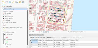
This week, we assessed property damage along the New Jersey coastline due to hurricane Sandy.  I have included an image of damage assessment points that I created and a summary table of the final results.  In order to create a point layer with the ability to add information based on visual damage analysis, I first created mosaic images of pre and post Sandy imagery and added those images to a damage assessment geodatabase.  I then created attribute domains in the geodatabase and input codes and descriptions for each domain in order to create a drop down list that made creating new points with proper information very easy.  I then created a new feature class and added fields that I could then relate to the domains I previously created.  Once I had attached the proper domains to assess the damage, I created a data point for each parcel in order to assess property damage.  The end result is shown in a screenshot below.


I attempted to identify familiar properties first, particularly residential areas. If I saw something that looked like a house, I assumed it was a residential property. I found all properties that appeared to be standing and in their original location, and judging from the evidence of flooding throughout the entire study area, was able to set Inundation to yes for every property.

I then found properties that were partially destroyed or completely destroyed and used the swipe tool to see just how much damage was done. Parking lots that were now covered with sediment I labeled as “destroyed” even though it could be possible that the sand could simply be removed and the asphalt still intact.

I used a 1:1,500 scale to get a decent view of each property. The most difficult thing to determine was the extent of flood damage to each property. It was obvious that flooding occurred throughout the study area, but impossible to tell the extent of property damage from an aerial photo.

Zoning information would have been useful because I could not tell the difference between government, industrial or other with any reliability. Having a familiarity of the area would also be greatly beneficial. 


Structure Damage Category

Count of Structures

0-100 m from coastline

Count of Structures 100-200 m from coastline

Count of Structures 200-300 m from coastline

No Damage

0

0

0

Affected

0

21

29

Minor Damage

0

3

12

Major Damage

1

13

0

Destroyed

12

2

5

Totals

13

39

46


To get the information for the above table, I drew a line on the coast as suggested in the lab instructions. I then used the distance tool to see where the 100m, 200m and 300m lines were and selected those buildings with the polygon selector tool to get the information for the table.

Obvious damage as perceived from viewing aerial photos is much harder to detect as you move farther from the coast. Most buildings were destroyed within 100m and although evidence of flooding was obvious everywhere, damage to buildings is less apparent as you move further from the coast.

I do not believe you can reliably extrapolate this information to other areas of the coast. The damage to the coast was highly variable and more in-depth analysis would be needed to get an accurate picture of the entire coast.


Wednesday, July 29, 2020

Storm Surge Analysis in New Jersey and Florida


This week, we looked at elevation data for the New Jersey shoreline from pre and post Sandy datasets, and compared two DEMs in Florida to determine the impacts of a 1M storm surge and comparing how the elevation data effects the results.  

Below, you will see the final difference in elevation on a stretch of the Jersey shore from before and after Sandy. The pre-Sandy file has a more consistent coastline in terms of obvious areas of development.  There are many areas that now look almost like little inlets where housing has clearly been destroyed and beaches eroded.  There are clearly some areas that were hit much harder than others and destruction is not consistent or even.  The areas of greatest erosion appear to be along the center left of the image.  This matches up with my observations of the differences between the two las images and confirms the areas of greatest destruction.  There appear to be some data anomalies as you move farther inland in that the difference between the two layers is as if the post layer was subtracting a value of zero.  This is also right next to areas that were apparently built up during the storm.  The take home message is that destruction was not equal and that more analysis should be done to gain a greater understanding of the situation.

This exercise was very good because it helped me to think about the many variables to consider when assessing pre and post storm damage.  It also helped me to see the impact of data that does not perfectly align and the general limitations in analysis such as this.


The map below is a comparison of a USGS DEM and a LiDar DEM to assess the coastal affects of a 1M storm surge. There are a number of potential issues related to how we assumed the lack of connectedness and uniform surge could influence the areas being impacted.  In reality, it is quite likely that areas not showing a complete connection or that are in a low lying area, but surrounded by higher ground, are actually connected and vulnerable enough to be impacted by the combination of high winds, rainfall, and variability in storm surge that is not encapsulated in a study that assumes this level of uniformity.  Just because storm surge might max out at a given height on average, it does not mean this impact is felt equally across all regions and even limited connectivity and semi-protected areas should be considered as points of vulnerability.  We could adjust our analysis by applying a storm surge range that gives us a level of uncertainty with which to work.  We could also review the areas that show limited connectivity and determine what might be causing that limitation.  All limits to connectivity of elevation are not created equally and having a deeper understanding of those areas would be very beneficial in designing a study to better model real world possibilities.  Rainfall and inland flooding should also be incorporated as variables in a realistic study.


This exercise was very beneficial for understanding the impact of DEM accuracy on flood analysis.  It also helped me to understand the many assumptions we make when relying on elevation data and constant variables in complex analysis.

Wednesday, July 22, 2020

Crime Analysis

This week, we looked at three different types of analysis for the purpose of predicting crime and thus enhancing the effectiveness of policing efforts.  We compared Grid Overlay, Kernel Density, and Local Moran's I analysis using 2017 homicide data in Chicago to predict areas of homicide in 2018 and thus determine the best analysis that can be used for a cost-effective solution for future policing efforts.

To complete the analysis I first set the environments so the extent and mask were equal to the boundary of Chicago. Then, for the Grid Overlay method, I used the spatial join tool and entered 2017 homicides to be joined with the Chicago grid. I then selected all grids that were greater than 0 and created a new layer called Homicide Count. I then selected the top 20% from those results. I had 311 total cases and the top 20% resulted in 62 cases selected. I then create another layer from that selection, dissolved it into a single field and the first map below was the result.

For Kernel Density, I used the Kernel Density tool on the 2017 homicides layer, selected an output cell size of 100 and a search radius of 2630. I then split the results into two categories: 0 to 3* the mean, and everything else above that. I then reclassified the data into those two categories and converted the raster to a polygon. After that, I selected all cases that were 3* the mean or greater and created a layer from that selection. The map is also shown below.

For the Moran’s I analysis, I again performed a spatial join between census tracts and 2017 homicides. I then added a new field in the attribute table and calculated the crime rate per 1000 homes. I then used the Cluster and Outlier Analysis tool. From that result, I selected the High-High results and created a new layer from that selection. After that, I dissolved the layer into a single field. The results are also shown below.
Grid Overlay

 Kernel Density

 Local Moran's I


Hotspot Technique
Total area (mi2) in 2017
Number of 2018 homicides within 2017 hotspot
% of all 2018 homicides within 2017 hotspot
Crime density (2018
homicides within 2017 hotspot per mi2)
Grid Overlay
15.46
159
27.00%
10.28
Kernel Density
26.67
262

44.48%

9.82
Local Moran's I
34.05
265

45.00%

7.78


The Kernel Density analysis provides the best model for predicting future homicides. This is because it captured nearly the exact same number of homicides in 2018 as the Local Moran’s I analysis, but did so in an area 7.38 square miles smaller. This would allow the enforcement effort to be much more concentrated and focused while addressing a similar amount of crime. Kernel Density is also better than the Grid Overlay method because it captures a much more significant number of overall homicides, and the density of homicides per square mile is not that much less in the Kernel Density analysis. So you definitely get the most bang for your buck with the Kernel Density analysis.

I also want to highlight what I think is a profound level of short-sightedness in an analysis such as this. While the stated objective and results of such analysis contain useful information, the desire to focus on a single variable as a cure for the problem of homicide creates the huge possibility of mismanagement, misallocation of resources, and even the active continuation and enhancement of foundational issues which ultimately result in situations where criminal activity incubates. These analyses can and should be used, but they must be used in ways that incorporate a fundamental understanding of wealth disparity, educational funding and availability, local economic opportunity, and other factors I am likely not mentioning here.

The issue of homicide, and crime in general, must be taken into consideration along with the functioning of society as a whole. If the police chief is asking for this information, we need to be asking the police chief who they are partnering with in the community in order to understand the underlying causes of such violence and work toward creating partnerships with the Health Departments, Education Departments, and the general governing body within a given community in order to find solutions that really get at the heart of the problem. A proactive and integrated approach can, in turn, create a more prosperous community that has great potential to reduce the burden on law enforcement and increase its overall effectiveness.

I suggest that we begin looking at these types of crime analysis with a much broader view of community interactions and attempt to limit the idea of a single variable solution.