This week, we assessed property damage along the New Jersey coastline due to hurricane Sandy. I have included an image of damage assessment points that I created and a summary table of the final results. In order to create a point layer with the ability to add information based on visual damage analysis, I first created mosaic images of pre and post Sandy imagery and added those images to a damage assessment geodatabase. I then created attribute domains in the geodatabase and input codes and descriptions for each domain in order to create a drop down list that made creating new points with proper information very easy. I then created a new feature class and added fields that I could then relate to the domains I previously created. Once I had attached the proper domains to assess the damage, I created a data point for each parcel in order to assess property damage. The end result is shown in a screenshot below.
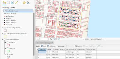
I attempted to identify familiar properties first, particularly residential areas. If I saw something that looked like a house, I assumed it was a residential property. I found all properties that appeared to be standing and in their original location, and judging from the evidence of flooding throughout the entire study area, was able to set Inundation to yes for every property.
I then found properties that were partially destroyed or completely destroyed and used the swipe tool to see just how much damage was done. Parking lots that were now covered with sediment I labeled as “destroyed” even though it could be possible that the sand could simply be removed and the asphalt still intact.
I used a 1:1,500 scale to get a decent view of each property. The most difficult thing to determine was the extent of flood damage to each property. It was obvious that flooding occurred throughout the study area, but impossible to tell the extent of property damage from an aerial photo.
Zoning information would have been useful because I could not tell the difference between government, industrial or other with any reliability. Having a familiarity of the area would also be greatly beneficial.
|
Structure Damage
Category
|
Count of Structures
0-100 m from
coastline
|
Count of
Structures 100-200 m from coastline
|
Count of
Structures 200-300 m from coastline
|
|
No Damage
|
0
|
0
|
0
|
|
Affected
|
0
|
21
|
29
|
|
Minor Damage
|
0
|
3
|
12
|
|
Major Damage
|
1
|
13
|
0
|
|
Destroyed
|
12
|
2
|
5
|
|
Totals
|
13
|
39
|
46
|
To get the information for the above table, I drew a line on the coast as suggested in the lab instructions. I then used the distance tool to see where the 100m, 200m and 300m lines were and selected those buildings with the polygon selector tool to get the information for the table.
Obvious damage as perceived from viewing aerial photos is much harder to detect as you move farther from the coast. Most buildings were destroyed within 100m and although evidence of flooding was obvious everywhere, damage to buildings is less apparent as you move further from the coast.
I do not believe you can reliably extrapolate this information to other areas of the coast. The damage to the coast was highly variable and more in-depth analysis would be needed to get an accurate picture of the entire coast.

